Lightweight BI system for university, part III: UX redesign of Teacher Analytics, targeting 5–10 minute weekly review
Executive summary
Within a single intensive week, with AI used as a force-multiplier, we moved a production educational analytics product from a flat, tab-heavy interface toward a layered decision-support workspace. The work covered the full cycle: UX and interface trend research, a timed key-user scenario, functional information architecture, a formal coverage matrix, stakeholder confirmation, visual direction, and migration of the working product onto the new UX.
The redesign is part of a larger transition. The first version was built in Streamlit and proved the analytical model, but the framework was becoming a constraint for the next stage of the product. The new interface is being implemented as a React workspace, providing considerably more control over interaction, information hierarchy and progressive disclosure.
The original baseline came from direct work in Moodle: a teacher’s group performance review took roughly 40 minutes of navigating the LMS gradebook, reports and individual activity logs. The product goal has always been to bring that down to 5–10 minutes with explainable analytics.
The central UX idea is not simply “fewer tabs”. It is a shorter feedback loop: what is happening → where is the problem → what data confirms it? The new interface is organised around this loop. Overview establishes the state of the group; Problems identify what deserves attention; Data provides the evidence and detailed indicators needed to verify and investigate it.
This post is the design and product companion to the earlier technical write-ups: Lightweight BI system for university, part I and part II (how the analytics is built) . Those posts describe the data model, the rule-based engine and the original nine-tab Streamlit surface. Here the focus is on why and how the interaction model and technical surface are changing.
The design problem: from analytics terminal to decision support
The first version already solved an important technical problem: it collected a large amount of educational data and turned it into structured, explainable findings. The remaining problem was interaction.
A teacher does not normally approach an analytics system with the question “which dashboard should I open?” The natural sequence is closer to:
- What is happening?
- Where is the problem?
- What data confirms or explains it?
In the original interface these three jobs were distributed across several equally weighted tabs. The user had to assemble the relationship between overview, finding and supporting data mentally.
The redesign therefore does not primarily optimise the number of screens. It optimises the feedback loop between interpretation and evidence.
The intended interaction is:
Overview → Problems → Evidence in Data → back to the decision
This creates a natural progressive-disclosure model. The system does not expose its full analytical depth immediately. It reveals the next level when the user has a reason to ask for it.
Where UX of data-heavy apps actually went
Before redesigning anything, we re-checked the broader trajectory of professional interface design over the last 15 years — not as a sequence of visual fashions, but as a gradual shift in what the interface is expected to organise.
- From chrome to content. One of the first decisive moves was rejecting heavy decorative frames and treating the interface itself as secondary. The data, the task and the user's context should come first; surrounding chrome should recede. This established a simple principle: the interface exists to support the work, not to compete with it.
- From individual screens to systems. Material Design and parallel design systems then brought a more systematic approach: shared components, predictable structure, consistent hierarchy and reusable interaction patterns. This improved coherence across large products, although it also created a new temptation to treat the component library itself as the centre of the design.
- From visual hierarchy to information hierarchy. The next wave became quieter: less decoration, less visual noise, less motion, and more emphasis on legibility, progressive disclosure and task efficiency. The important question increasingly became not “What can we put on this screen?” but “What does the user need to understand or do at this point?”
- From information hierarchy to decision flow. For data-heavy applications, this leads to a more fundamental shift. The interface does not have to expose analytical instruments as the primary navigation model. It can instead structure the user's reasoning: what is happening → where is the problem → what data confirms it → what should I decide? Dashboards and detailed analytical views do not disappear; they become evidence and working instruments inside a larger decision-support flow.
This is the direction that matters for educational analytics. A teacher does not naturally think in terms of dashboards or analytical modules. The practical question is closer to: what is happening in my course, where should I pay attention, and what evidence supports that conclusion?
So the goal is not to build another analytical terminal. It is to provide a calm, hierarchical surface that supports this reasoning loop: orient first, identify the problem, verify it with data, and then decide — without forcing the teacher to reconstruct the analytical model of the system for every weekly review.
The old design — what we started from
The first production surface was a Streamlit dashboard with a global sidebar and nine specialised tabs:
- Themes (level-1 “flower” overview)
- Questions
- Student
- Insights
- Risk group
- Trends
- Score structure
- Deadlines / attempts / effort
- Attendance and activity
It already delivered the analytical model: rule-based findings with evidence, hypothesis, alternatives, recommendations and limits; theme map as orientation anchor; and full coverage of the ТЗ queries.
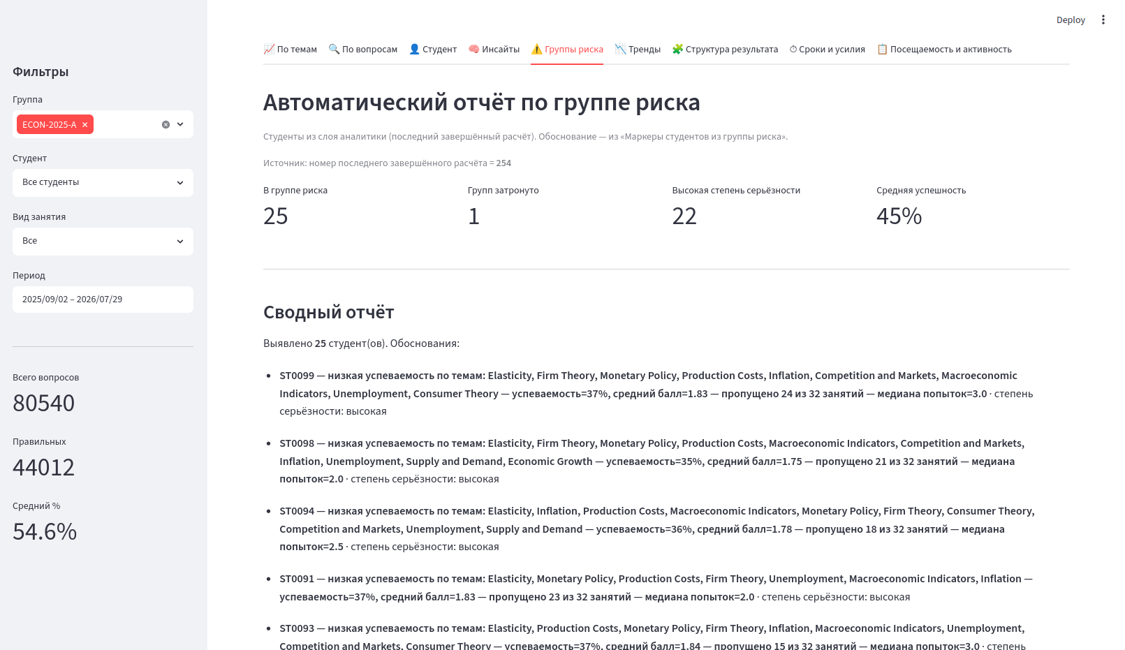
Strengths we kept: complete analytical coverage, explainable (non-LLM) findings, a solid incremental engine, and the theme map as the central orientation device.
Pain points that still stood in the way of the 5–10 minute target:
- Flat information architecture. Nine equally weighted tabs forced constant context reconstruction.
- Cognitive overload. Dense tables and uniform visual weight made the tool feel closer to a terminal than to decision support.
- Weak progressive disclosure. Findings and full BI lived on the same mental plane; the weekly path had no privileged short route.
- Context reconstruction. Moving between tabs could feel like starting over; filters lived in a sidebar that was easy to forget.
- Technology constraint. Streamlit was useful for validating the analytical concept and getting the first working product running quickly. As the interaction model became more sophisticated, however, it provided less flexibility and control than the product required for the next stage.
The ~40-minute baseline itself was measured in direct work with Moodle (gradebook, reports, activity logs), not on this first dashboard. The Streamlit surface was already an attempt to shrink that time; the UX redesign removes the remaining interaction friction while the technology migration provides the flexibility needed to implement the new model properly.
Key user scenario broken down by timing
The primary job is a weekly (or post-control) performance review. The original cost was measured in Moodle; the first product version reduced part of that cost; the redesign targets the remaining friction so the intended path fits the 5–10 minute band.
Baseline — direct work in Moodle (~40 minutes)
- 0–10 min. Open course, gradebook and multiple reports; locate the relevant group and period.
- 10–25 min. Cross-check topic results, individual attempts, attendance and activity logs; open students individually where needed.
- 25–40 min. Mentally synthesise what needs attention — which topics, which students, which items to simplify or repeat — and form an action list.
First product version — structured, but still flat
Nine flat tabs and sidebar filters already replaced raw Moodle navigation with structured panels and explainable findings. Orientation and cross-referencing, however, still cost time: the user had to reconstruct “what is still relevant for this slice” after every tab switch.
After redesign — the intended 5–10 minute path
- 0–30 sec. Global context shows the active slice (course › theme › student › work type). Three KPI cards and the theme map answer: “What is the state of the group?”
- 30 sec – 3 min. Open Problems (Findings). Prioritised signals show severity, a short rationale and “Подробнее”. The user does not need to hunt across several analytical tabs.
- 3–7 min. Open one or two findings into full xAI cards: hypothesis, evidence, alternatives, recommendations and limits. Drill into a theme or student while the global context remains intact.
- 7–10 min. If a specific indicator or additional confirmation is required, move to Data and open the corresponding panel. Every ТЗ query still has an address, but the default path does not require visiting all of them.
The time saving is therefore not simply “fewer screens”. It comes from shortening the feedback loop and separating three jobs that previously competed on the same flat surface: orient → identify the problem → verify with data .
Functional design & information architecture
The redesign does not delete capability. It re-sequences it around the teacher's decision process.
- Global context (course › theme › topic › student + work type) is always visible and never silently reset.
- Overview establishes what is happening.
- Problems / Findings identifies where attention is required.
- Data / Analytics provides the evidence and detailed indicators needed to confirm, investigate or challenge the finding.
- Theme map (“цветочки”) remains the central orientation device on Overview.
- Every ТЗ query 1–14 has an explicit address under Data (Performance / Learning process / Assessment / Students).
The resulting UX contract is deliberately simple:
Overview tells me what is happening.
Problems tell me where to look.
Data tells me what confirms it.
This is the core of the redesign. The three layers are not merely different navigation categories; they form a single analytical feedback loop on the same data slice.
Functional wireframe of the Overview layer (global context + KPIs + theme map):
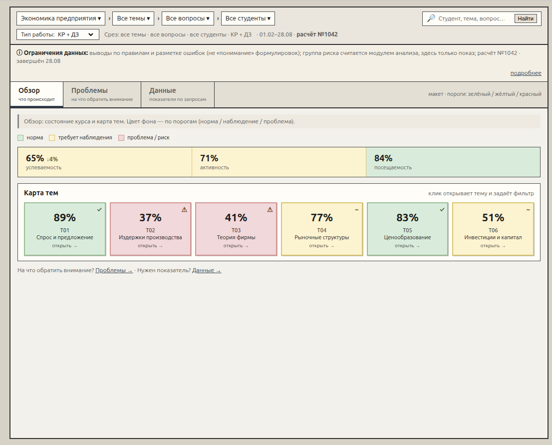
Figure 1. Functional design — Overview. Context is persistent; colour of theme cards follows thresholds (green / yellow / red).
Layer responsibilities:
| Layer | What it contains | What it deliberately does not contain |
|---|---|---|
| Context (global) | Course › Theme › Topic › Student · Work type · Slice line + run # | Search as primary entry; per-tab filter islands |
| Overview | 3 KPIs (performance / activity / attendance) + theme map | Full tables, complete findings list, attempts |
| Problems (Findings) | Prioritised signals for the current slice · “Подробнее” → Finding + Evidence + Action | Full BI catalogue |
| Data (Analytics) | Performance / Learning process / Assessment / Students — all panels for queries 1–14 | Mandatory “start from a finding” workflow |
Coverage matrix — requirements ↔ new UX
A formal matrix was produced so stakeholders could verify that a navigation change does not equal functional loss. Two independent acceptance criteria were kept separate:
- UX coverage — is the 30-second / 2-minute / 5–10-minute path comfortable?
- Requirement coverage — where does each US / ТЗ item live physically?
This distinction matters. A simpler interface is not a successful redesign if it achieves simplicity by hiding or removing required analytical capabilities.
Excerpt (US → UX location in IA v3):
| Requirement | UX location (v3) | Coverage |
|---|---|---|
| US-1.1 Overview by themes | Overview → Theme map | yes |
| US-1.4 Short interpretation | Problems (Findings); optional signal under map | yes |
| US-2.1–2.6 Queries 1–14 | Data → Performance / Learning / Assessment / Students | yes |
| US-3.1–3.4 Context continuity | Global context bar + “never silent reset” contract | yes |
| US-4.1–4.3 Student / Risk | Data → Students / Risk · Student card | yes |
| US-5.1–5.2 XAI / patterns | Problems → detail → Finding + Evidence + Action | yes |
| ТЗ §3.1–3.2 Interpretation & risk | Problems · Difficulty · Risk | yes |
Current → Proposed mapping of the nine Streamlit surfaces was also documented: themes → Overview flowers; insights → Problems; remaining tabs → Data groups; sidebar → global context.
The principle communicated to stakeholders was simple: “navigation changed, requirements not lost.”
From Streamlit to React
The UX redesign also exposed a technology decision. The first version was intentionally built in Streamlit because it provided a fast route from analytical code to a working interface. That was appropriate for validating the product concept.
As the product evolved, however, the interface itself became part of the engineering problem. Persistent context, layered navigation, progressive disclosure, richer interactions and precise control over the visual hierarchy required more flexibility than the original framework comfortably provided.
The product is therefore moving from Streamlit to React. This is not a cosmetic technology replacement. It is a migration from a rapid analytical surface to a UI architecture capable of supporting the intended interaction model.
The migration is already more than halfway complete. The remaining Data layer is deliberately not being redesigned from scratch: its role is primarily to bring the existing first-version dashboards into the new information architecture. This keeps the migration focused on the parts where UX change creates the greatest value.
In other words, the new architecture changes the route through the analytics without requiring the analytical depth itself to be rebuilt.
Applying the new design — current product
The new workspace is already implemented for the main interaction path. The visible outcomes are:
- Calm, modern visual system — content before chrome, without unnecessary decoration.
- Persistent global context + three clear layers: Overview / Problems / Data.
- Theme map retained as the orientation anchor.
- Findings list established as the attention layer.
- xAI cards with hypothesis, evidence, alternatives, recommendations and limits remain first-class.
- The full analytical catalogue remains accessible through the Data layer.
- Core weekly review path is designed around a 5–10 minute target, against a ~40-minute Moodle baseline.
Overview — what is happening?
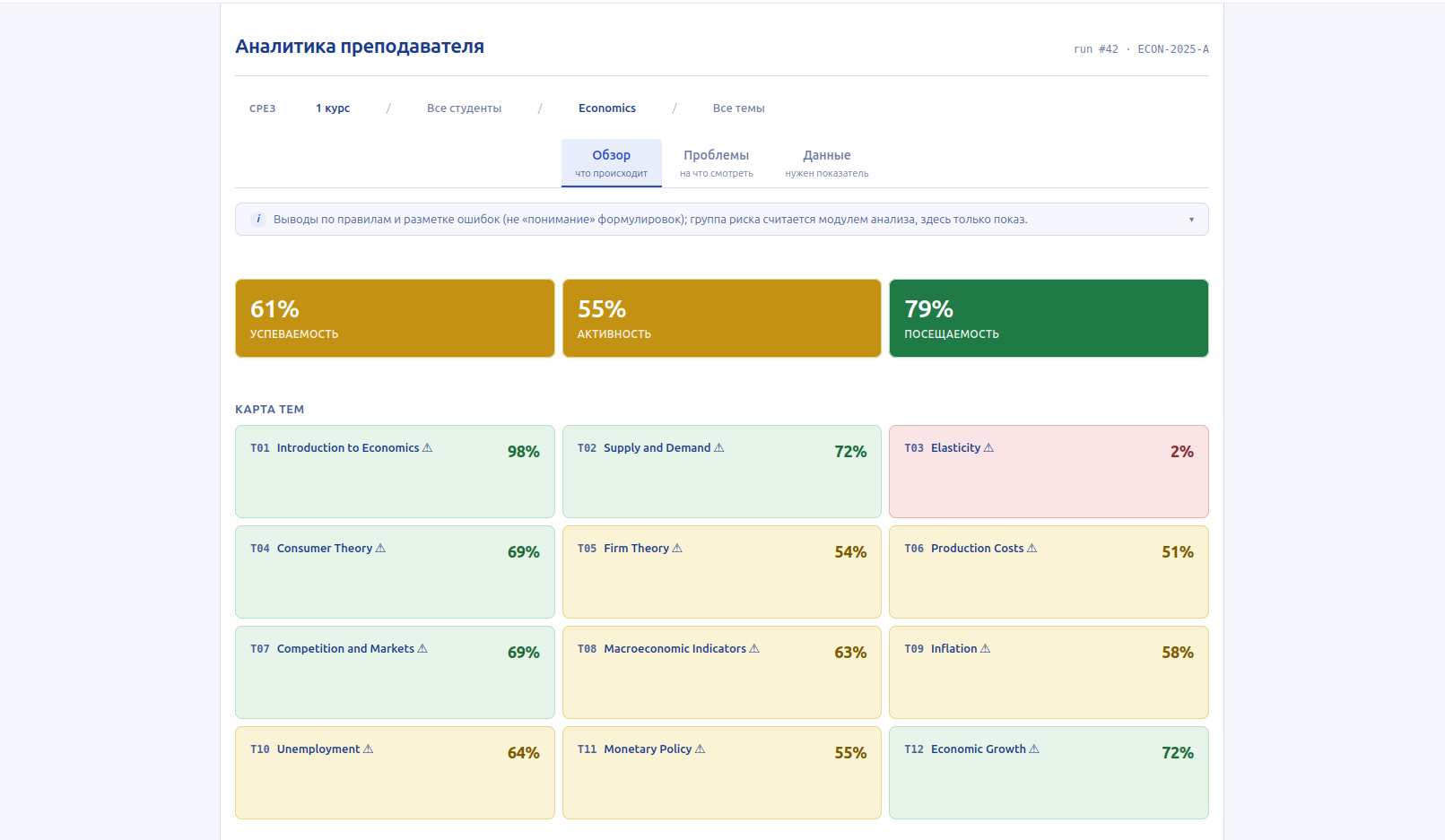
Figure 2. Production Overview: KPI strip + colour-coded theme map.
Problems — where is the problem?
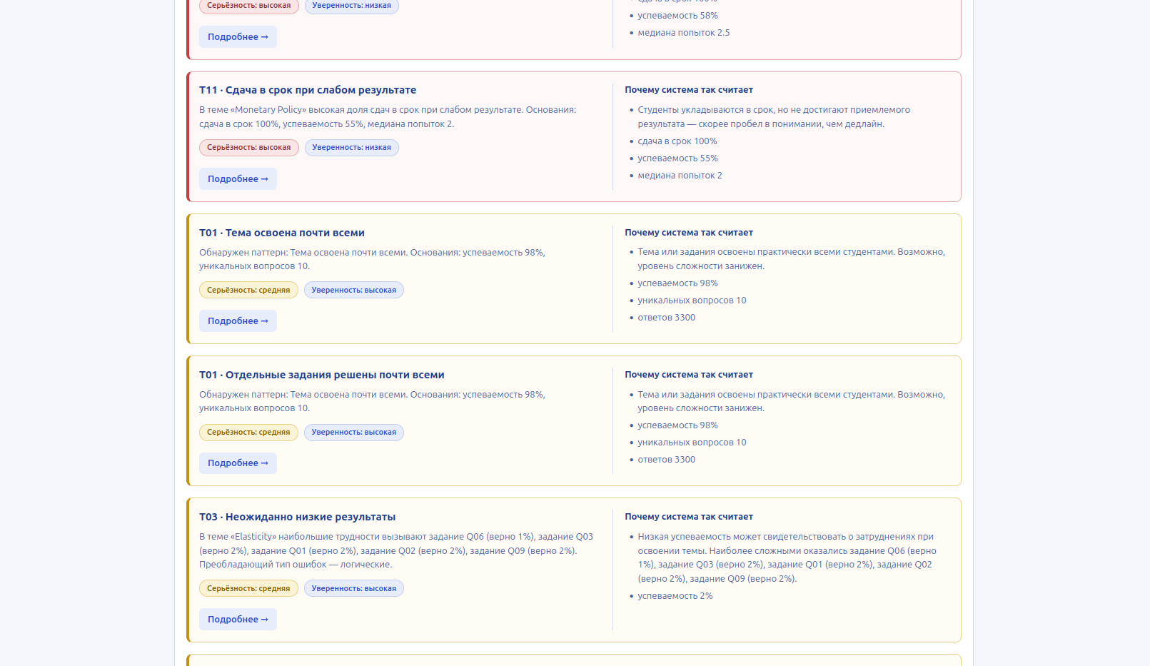
Figure 3. Problems layer: prioritised findings with severity and short rationale.
Finding detail — why does the system think this is a problem?
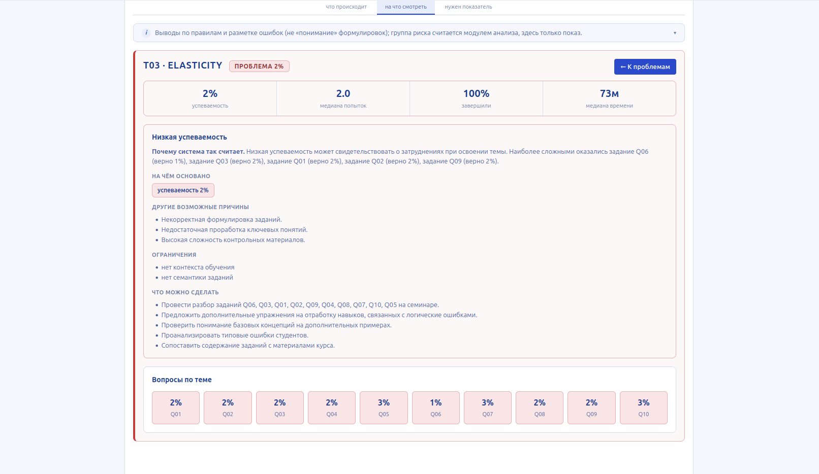
Figure 4. Full xAI card: hypothesis, evidence, alternatives, recommendations and limits.
Data — what confirms it?
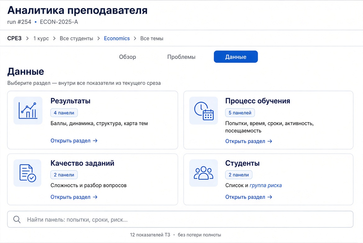
Figure 5. Data layer: Performance, Learning process, Assessment quality, Students — full coverage without forcing a findings-first workflow.
The Data layer shown here is currently a design concept. Its implementation is the remaining major part of the UX migration and is expected to reuse the existing first-version dashboards rather than introduce another analytical redesign.
Value delivered
The product is moving from a dense analytical terminal toward a decision-support environment built around a much more natural sequence of work:
- What is happening? Overview provides fast orientation.
- Where is the problem? Problems prioritises the signals that deserve attention.
- What confirms it? Data provides the underlying indicators and detailed evidence.
This preserves the analytical depth of the original product while reducing the amount of mental work required to use it.
- Respects limited attention through progressive disclosure.
- Keeps every requirement reachable (the coverage matrix provides the traceability).
- Builds trust through transparent, rule-based xAI findings.
- Preserves analytical depth while making the default path short.
- Provides a clear route from observation to problem to evidence.
- Moves the UI from Streamlit to React to support the required interaction model and future product development.
The target is a focused 5–10 minute weekly review, starting from a ~40-minute Moodle baseline. This is a design and product target, not yet a post-redesign user-test result.
The redesign therefore is not simply a visual refresh. It is a change in the interaction model of the product: orient → identify → verify → decide.
The remaining work is intentionally narrower than the redesign already completed: migrate the existing analytical dashboards into the Data layer and complete the React migration. The main UX architecture and decision-support path are already in place.
Prepared with assistance from ChatGPT and Grok.
Related publications
Lightweight BI system for university, part I
Lightweight BI system for university, part II:
how the analytics is built
Broad vs Narrow specialisation