Lightweight BI system for university, part II: how the analytics is built
Executive summary
Part I described the constraints of the project, the synthetic LMS dataset, and the overall shape of a lightweight BI system for university instructors: reduce group review from roughly 40 minutes to 5–10 minutes, without black-box LLMs for educational decisions, and with explainable AI (xAI) as a hard requirement.
This part focuses on how analytics is actually constructed — not on another catalogue of charts, but on the path from raw LMS facts to findings that an instructor can accept, reject, or act on.
The system separates two concerns that are often mixed in “AI dashboards”:
- Visual panels — the same kinds of facts that already live in Moodle-like systems, organised for teaching decisions (themes, questions, scores, trends, effort, attendance);
- Rule-based insights — findings with evidence, hypotheses, alternative explanations, confidence, limitations, and recommended interventions.
Analytics runs in a dedicated analytics-engine: incremental batches over changed topics, snapshot rules on topic metrics, trend rules on time series, student-risk signals, and persisted explanations. The Streamlit dashboard is mostly a reader of facts and of the latest completed analytics run.
The dashboard exposes nine tabs. Together they cover level-1 “flower” overviews and level-2 panels aligned with LMS queries (scores, dynamics, score structure, deadlines and attempts, difficulty extremes, attendance and activity), plus an insights layer and an at-risk group report.
Roughly thirty finding types and a separate student-risk signal set implement the extraction logic. Listing every rule would turn this post into a reference manual. The value is in the extraction pattern. Below, that pattern is shown end-to-end, then illustrated with non-trivial rules and with three screenshots from a live run on synthetic Economics data.
The design principle stays the same as in part I: the system supports judgment; it does not replace the instructor.
Relation to part I
| Part I | Part II |
|---|---|
| Customer, ethics, synthetic data, high-level components | Pipeline of metrics → rules → explanations |
| Dashboard mentioned as UI shell | All nine tabs and what each is for |
| “Decision support, not charts only” | Concrete finding families, non-trivial rules, screenshots |
For context on constraints, synthetic generation, and the first version of the UI, see Lightweight BI system for university, part I.
Architectural principle: visualisation vs interpretation
Instructors do not need another dump of averages. They need a short path from observation to possible intervention.
| Layer | Role | Examples |
|---|---|---|
| Facts | LMS-derived tables in the AI database | attempts, question results, attendance, weekly activity |
| Metrics | Aggregates per topic / student / period | accuracy, error shares, on-time rate, median attempts, engagement |
| Findings | Rule matches with evidence | low accuracy, missed deadline vs did not understand, declining mastery |
| Explanations | xAI text structure | observation, hypothesis, alternatives, actions, uncertainty |
| UI | Tabs | explore facts; read findings on Insights and Risk |
Rules are thresholds + logic, not generative models. Thresholds can be calibrated per course (YAML, optional admin UI) without rewriting rules. Empty insights are not always a defect: if every submission is on time, deadline rules correctly stay silent; if a topic spans only two weeks, decline-streak rules may not fire.
How the analytics engine works
Incremental batch
- Read unprocessed changes (topics, results, assignments, activity, …).
- Resolve an impact set of topic ids.
- Hydrate state for those topics (results, attempts, attendance, activity, students).
- Compute: metrics → snapshot rules → trend rules → enrich → explanations → student metrics → risk flags.
- Persist a new analytics run; acknowledge changes.
Only touched topics are recomputed. A pipeline lock avoids concurrent writers.
Three families of logic
| Family | Input | Output |
|---|---|---|
| Snapshot (topic / question) | Topic metrics (+ question context) | Findings: accuracy, errors, effort, deadlines, engagement, none/all solved, … |
| Trend | Per-topic time series (e.g. weekly score and attempts) | Declining / improving mastery, rising effort with flat score, volatility |
| Student risk | Per-student metrics | Signals + justification + severity (not the same object as topic findings) |
Every topic finding is expected to carry evidence (metric values). The explanation layer adds hypothesis, alternatives, recommended actions, and limitations.
What the engine deliberately does not do
- It does not invent causal certainty (“this student failed because of X”).
- It does not replace the Moodle gradebook.
- It does not call an LLM to invent recommendations for production educational decisions (customer constraint described in part I).
From metrics to a finding: the extraction pattern
Regardless of which of the ~30 finding types fires, the path is the same:
- Aggregate raw rows into a metric row (topic or student).
- Evaluate a pure rule: thresholds + boolean conditions + minimum sample size.
- Attach evidence strings that a human can check against the dashboard tables.
- Render a fixed explanation schema: observation → hypothesis → alternatives → recommendations → limitations.
The non-trivial part is rarely the inequality accuracy < 0.5.
It is choosing which combinations of signals change the instructor’s next action,
and forcing the system to show alternatives when several stories fit the same numbers.
Non-trivial rules (worked examples)
Trivial rules (“accuracy is low”) are necessary, but they are not where the design effort sits. The following three families are more characteristic of the system.
1. Deadline versus understanding
LMS attempts carry both a score and an on-time flag (and often duration). Two different teaching problems produce similar “weak result” charts:
- Missed deadline — share of on-time submissions is low, but accuracy is still in an “acceptable” band → time management / workload / cutoff design;
- Did not understand — submissions are mostly on time, accuracy is weak, often with many attempts → content, prerequisites, or item design.
Related variants include on-time submission with very few attempts and a weak score (shallow engagement) and a long single attempt with a weak score (stuck without recovery). On the current synthetic set, almost all attempts are marked on time, so missed deadline correctly does not fire. That is a data property, not a missing rule.
2. Multi-signal student risk
Topic findings answer “what is wrong with the theme”. Risk answers “who needs attention, with a short rationale”.
A student enters the risk set only when several independent signals co-occur (weak accuracy across topics, low average score, absences, attempt patterns, engagement extremes, late rate, …), above a minimum answer count. Severity is derived from how deep accuracy falls and how many signals stack. Justification text is assembled from the same signals so the instructor can audit the row without opening a black box.
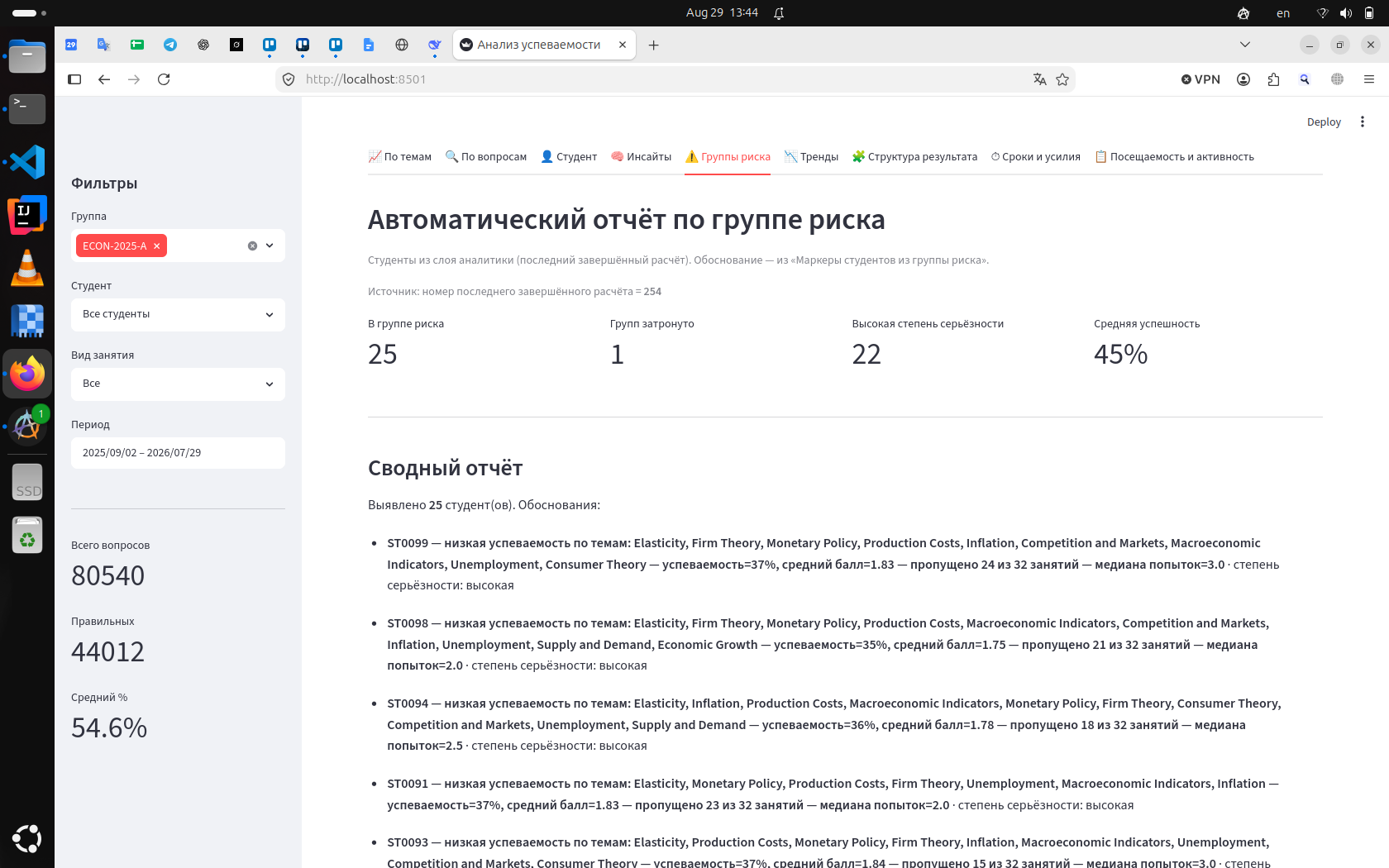
In the run shown above, the report lists 25 students, 22 of them at high severity, with mean success around 45%. Each line combines weak topics, accuracy, average score, missed sessions, and median attempts. That is the “summary report on the risk group with rationale” from the original requirements — not a single red flag on one metric.
3. Score structure as a bridge to intervention
Before recommending a seminar on a topic, the instructor needs to see how far that topic pulls the cohort below the slice average. The score-structure panel ranks themes by result and by delta to the overall mean (descriptive gap, not a causal “contribution” claim).
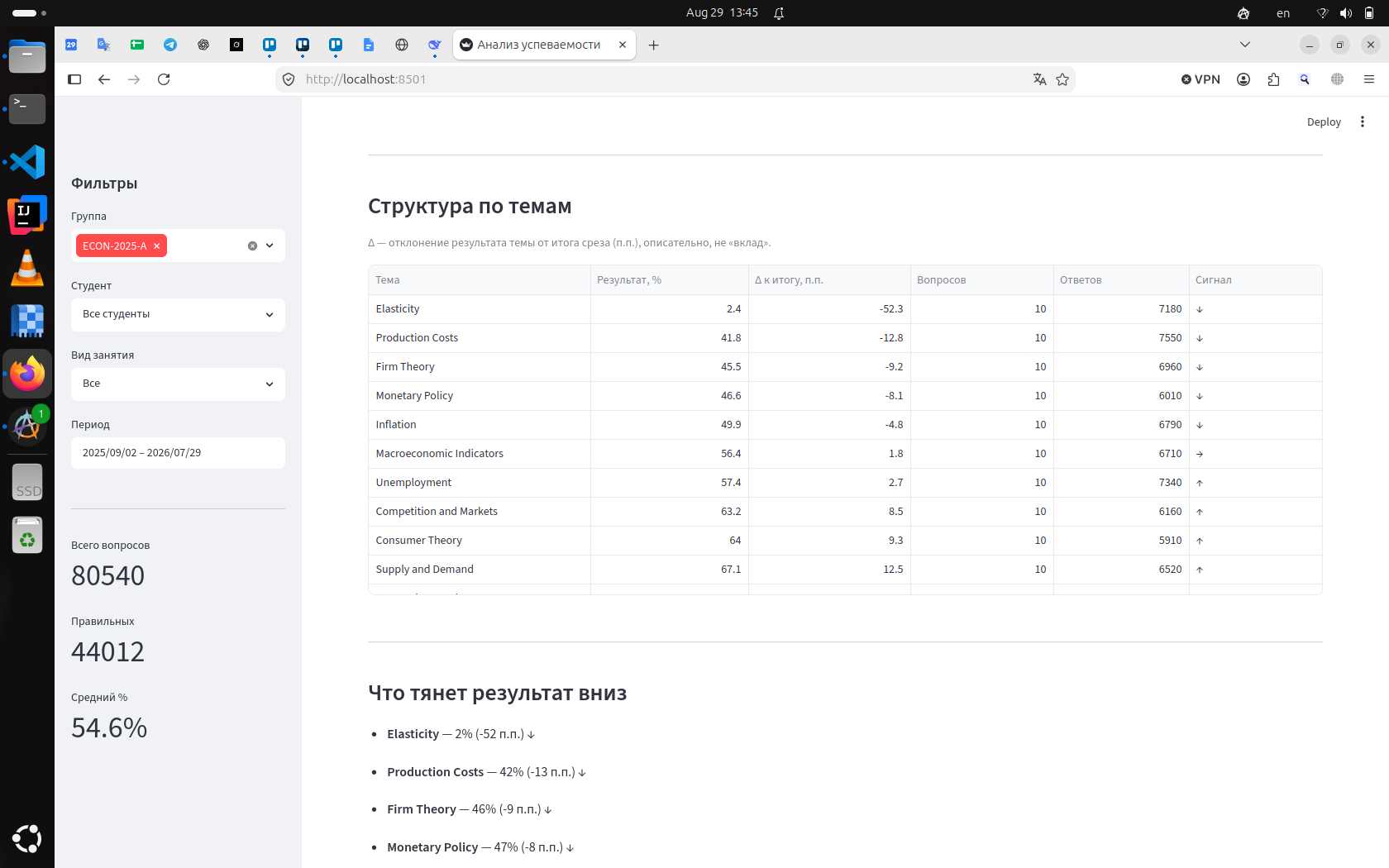
Elasticity sits at roughly 2% with a −52 percentage-point gap to the slice average. Production Costs, Firm Theory, and Monetary Policy follow with smaller negative deltas. The same numbers feed snapshot findings; the table is the visual counterpart of “what to open first on Insights”.
4. Insights card: full xAI schema on a hard theme
When a theme such as Elasticity collapses to ~2% accuracy with full completion, a low-accuracy (or none-solved) rule is expected. The product value is not the label; it is the structured card the instructor actually reads.
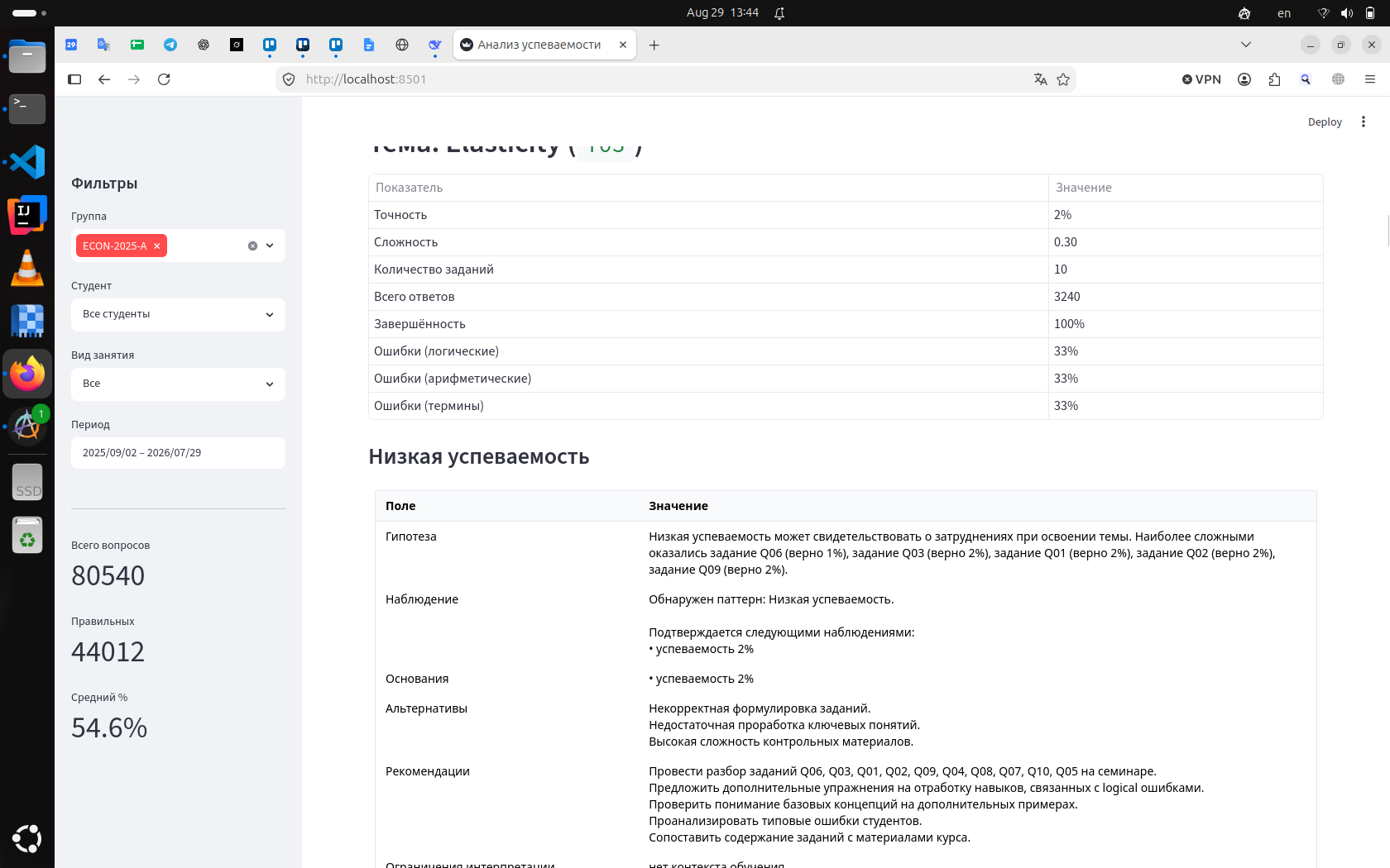
The card separates:
- Hypothesis — possible teaching meaning, including the hardest items (Q06, Q03, …);
- Observation / evidence — the pattern and the supporting rate;
- Alternatives — poor item wording, weak prerequisites, overly hard control materials (so “bad students” is not the only story);
- Recommendations — concrete seminar focus, drills on logical errors, checks of basic concepts;
- Limits — e.g. missing instructional context (what was taught that week).
That structure is applied across finding types. Adding a new rule means implementing the same contract, not inventing a new prose style per metric.
The nine tabs
Global sidebar filters (group, student, assignment type, period) apply across the visual tabs. Insights and risk read the latest completed analytics run.
1. Themes (level-1 “flowers”)
Question: where does the cohort struggle by topic?
Performance and error structure (logical / arithmetic / terminology).
Snapshot rules on accuracy, error dominance, pressure, all/none solved continue
on the Insights tab.
2. Questions
Question: which items are too hard or too easy?
Item-level success rates; question rules such as almost nobody / almost everybody solved
support simplify / complicate recommendations.
3. Student
Question: how is one student doing across topics?
Drill-down in the current filter slice. Multi-signal problems surface on Risk group.
4. Insights
Question: what stands out, and what might I do?
Main surface for topic and question findings after explanation generation —
the “intelligent assistant” layer, not a second gradebook.
5. Risk group
Question: who needs attention, and why?
Named students with severity and justification. Complements Insights
(theme problems versus people).
6. Trends
Question: is mastery rising or falling over time?
Score and attempts over periods. Trend findings (decline, improve, effort up with flat score,
volatility) need a long enough series per topic; short sequential courses may yield few hits.
7. Score structure
Question: what pulls the observed result down?
Descriptive ranking and deltas (screenshot above). Exploration first; Insights still carry
formal findings.
8. Deadlines, attempts, and effort
Question: did they run out of time, or fail to understand?
On-time rate, median attempts, time-on-task, score side by side — the metric surface for
the deadline-versus-understanding rules.
9. Attendance and activity
Question: do absences or empty LMS activity explain weak results?
Attendance and engagement crossed with scores; topic-level patterns and student-risk signals
(e.g. high engagement with low results, low attendance with low results).
Cross-cutting behaviour
- Empty insights are not always a bug. Rules fire on patterns present in the facts.
- Insights ≠ all nine tabs. Tabs 1–3 and 6–9 are exploration; 4–5 carry structured conclusions.
- Human remains responsible. Alternatives and limitations are part of the product.
- Production data path (forward-looking): Moodle primary → isolated replica → ETL into the AI database → engine → dashboard. Applications do not connect to the LMS primary.
What this implies for “AI in education” dashboards
A large share of educational “AI” demos still jumps from a chart to a paragraph of model-generated advice. This prototype takes the opposite route: measurable indicators first, rule matches second, prose last — and only inside a fixed schema.
That is slower to market as a feature list, but it matches the customer constraint (no LLM for graded educational decisions) and matches how instructors already argue in staff meetings: numbers, competing explanations, then a concrete next step.
Next steps
- Deep-links from a finding to the matching visual tab with filters preserved;
- Instructor auth / RBAC before wide production use;
- Calibration of thresholds on real course extracts once the replica + ETL path is live;
- Richer synthetic (or real) patterns for rare rules — e.g. late submissions, long per-topic time series.
Related publications
Lightweight BI system for university, part I
Lightweight BI system for university, part III: UX redesign targeting 5–10 minute weekly review
Artificial Intelligence in Education and Management